Rebrand
UPS Redesign
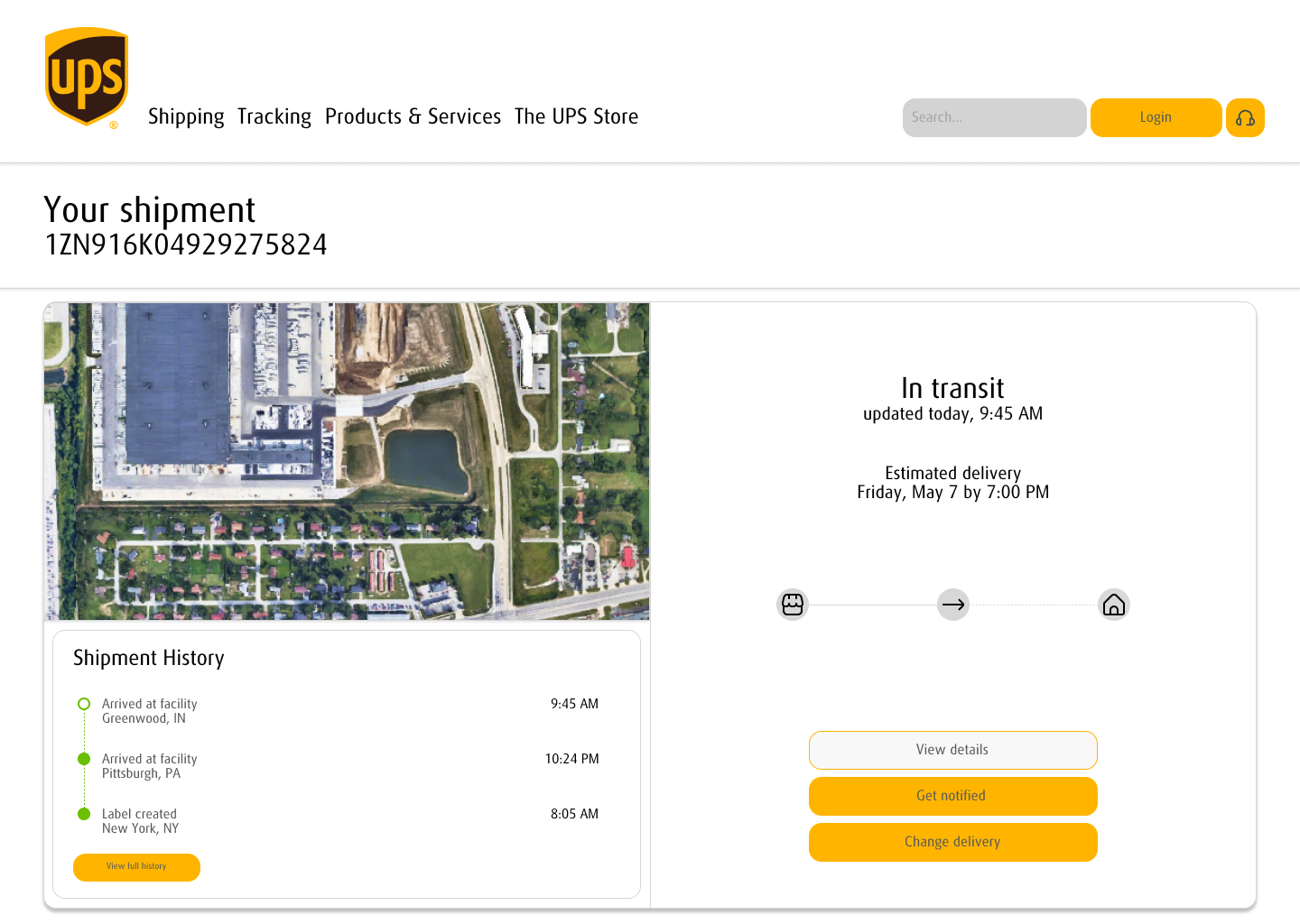
A focused redesign exercise reimagining a single screen of the UPS desktop experience with a cleaner, more modern approach.
01
Overview
The UPS website serves millions of users daily, but its interface hasn't always kept pace with modern design expectations. This project was a focused redesign exercise — taking a single screen from the existing site and reimagining it with cleaner layout, improved visual hierarchy, and a more contemporary feel while staying true to the established UPS brand identity.
Role
Design
Research
Research
02
Before & After

Original
Redesign
03
Brand Identity
#351C15
UPS Brown
#FFB500
UPS Gold
Typography
Aa Bb Cc Dd Ee
Ff Gg Hh Ii Jj Kk
UPS Sans