Jetset
A visually rich travel platform designed to inspire wanderlust and simplify the journey from dreaming to booking.
Overview
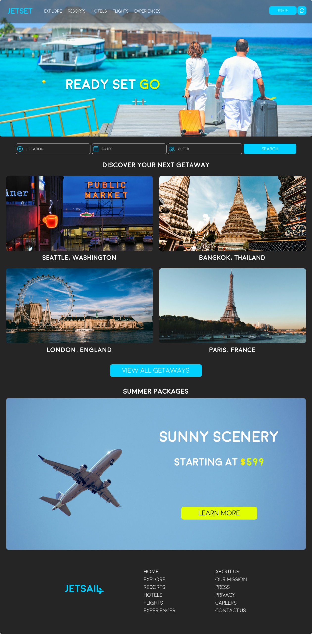
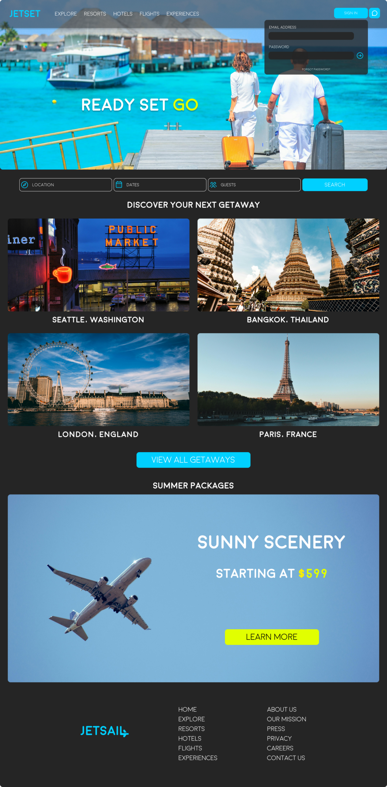
Travel planning should feel like the beginning of an adventure — not a chore. Through competitive analysis of platforms like Expedia, Kayak, and Airbnb, I found that most booking sites prioritize function over feeling. The experience often reduces beautiful destinations to rows of prices and star ratings. Jetset was designed to flip that dynamic, leading with stunning destination imagery and an editorial sensibility that makes browsing feel more like flipping through a travel magazine than filling out a form.
The bold, dark interface lets the photography take center stage, while the vibrant cyan and yellow-green accents create a sense of energy and excitement. Every interaction — from searching a location to selecting dates and guests — was designed to feel fluid and immediate. The result is a brand identity that feels premium and aspirational without sacrificing usability, giving travelers the confidence and excitement to take the next step.
Role
Research
Strategy
Identity
Product Design
Screens


Process
Travel planning should feel like the beginning of an adventure — not a chore. Through competitive analysis of platforms like Expedia, Kayak, and Airbnb, I found that most booking sites prioritize function over feeling. The experience often reduces beautiful destinations to rows of prices and star ratings. Jetset was designed to flip that dynamic, leading with stunning destination imagery and an editorial sensibility that makes browsing feel more like flipping through a travel magazine than filling out a form.
The bold, dark interface lets the photography take center stage, while the vibrant cyan and yellow-green accents create a sense of energy and excitement. Every interaction — from searching a location to selecting dates and guests — was designed to feel fluid and immediate. The result is a brand identity that feels premium and aspirational without sacrificing usability, giving travelers the confidence and excitement to take the next step.
Brand Identity
Typography
Aa Bb Cc Dd Ee
Ff Gg Hh Ii Jj Kk
Outfit · Display