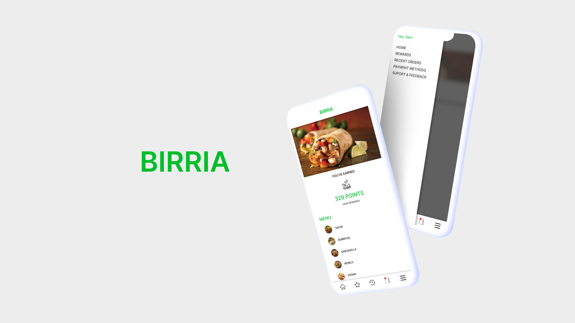
BIRRIA APPLICATION CONCEPT
OVERVIEW
Everyone is leading a busy life, so the goal of this project was to create a mobile ordering application for a food truck that was simple, easy to use, and allowed users to better plan ahead for pickup.
ROLE
Design
Research
Strategy
Identity
Product Design
RESEARCH & TESTING
I conducted user research with three participants to determine what was most important to a user when ordering via a restaurant's mobile application.
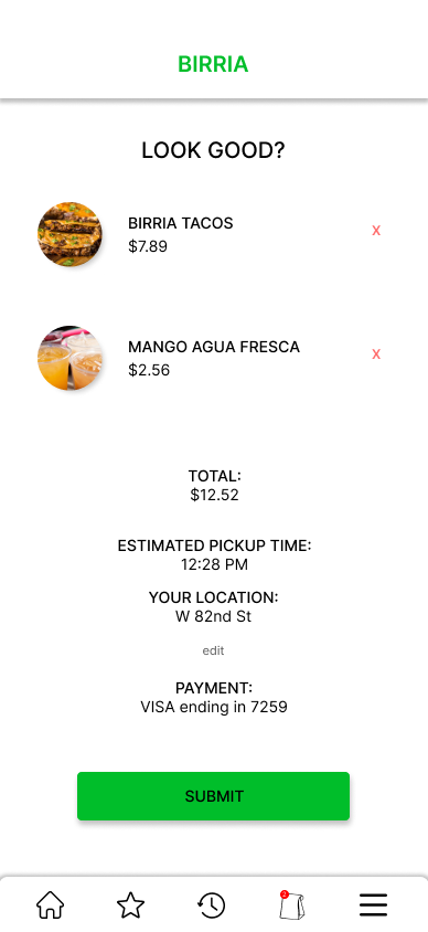
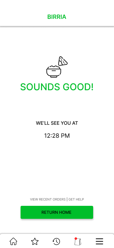
I found that users want a simple experience that allows them to better know when their order will be ready.
USER PAIN POINTS

WAIT TIMES
Users do not want to wait a long time for their order and want to know what the expected wait time will be.

EASE OF USE
Users want a simple experience when placing an order via a mobile app.

TRANSPARENCY
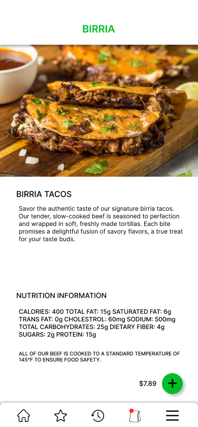
Not having enough information about the products offered can create frustrations.
PROTOTYPES & USABILITY STUDY
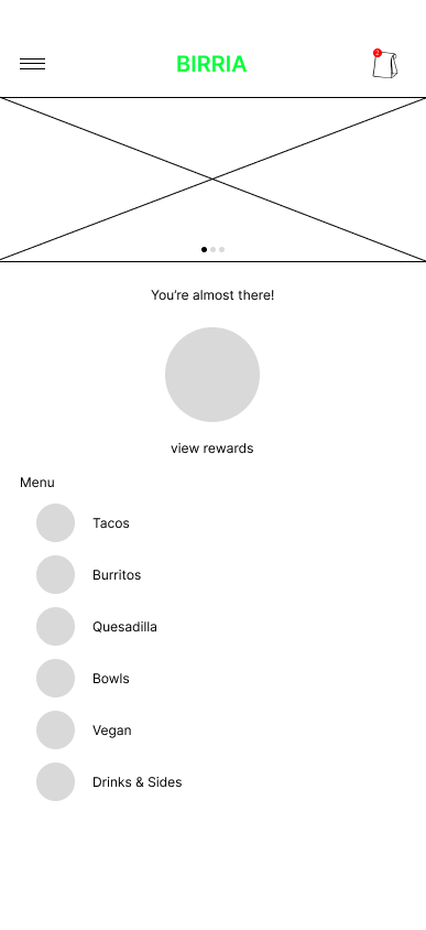
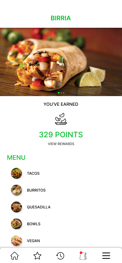
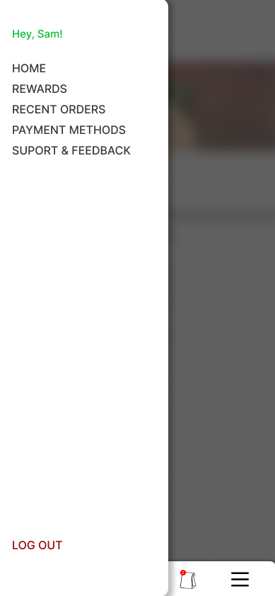
A usability study was conducted with three participants on the initial low fidelity prototype. It was found that the hamburger menu was less intuitive for easy access to menu options and was pulled down to a bottom navigation containing the most important menus.
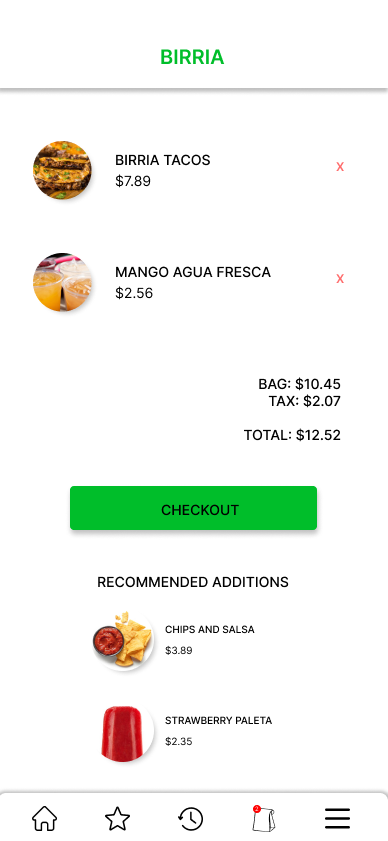
Users also wanted to see more recommended options during the order process for items they may not have previously seen when browsing the menu.
REFINED ORDER PROCESS
ACCESSIBILITY CONSIDERATIONS
COLOR
The design uses a minimal color palette, providing visual clarity.
NAVIGATION
Actionable buttons and options are large and clear for easier identification.
MULTIPLE WAYS
The application includes two routes of navigation via the bottom navigation and hamburger menu with clearly labeled text.